

Kosa Wellness: Designing a Serene Yoga Brand Identity
We built a serene brand identity for Kosa Wellness that brings the quiet feeling of yoga to everyone.

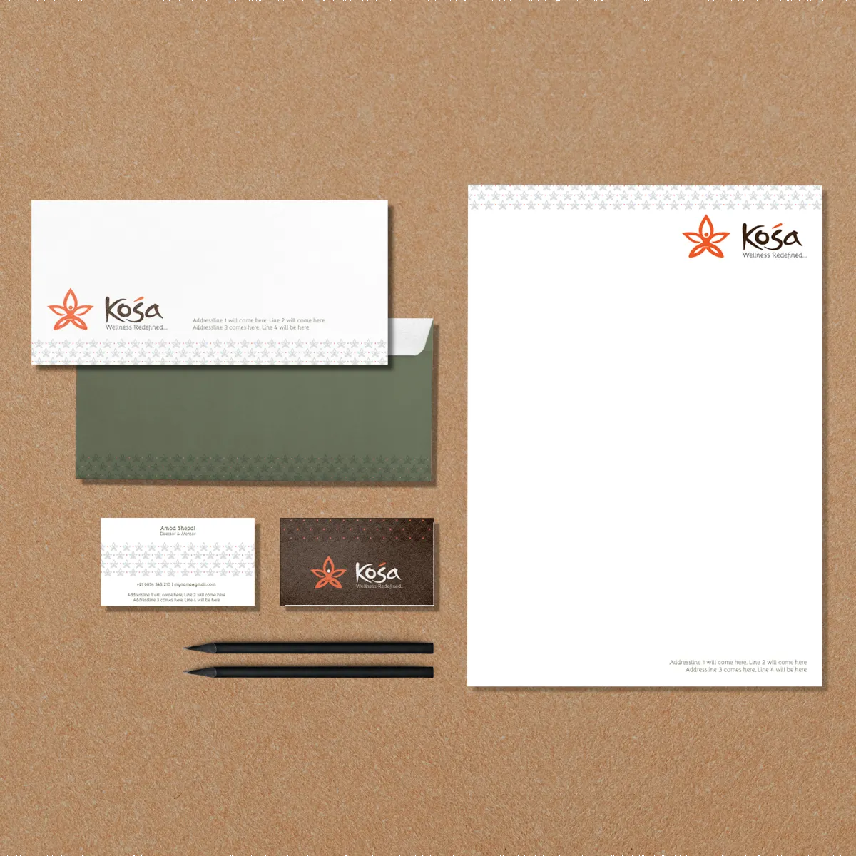
We built a serene brand identity for Kosa Wellness that brings the quiet feeling of yoga to everyone.
The client came to us wanting to turn his knowledge of yoga and physical fitness into a new brand from the ground up. The goal wasn't to cater to a narrow niche, but to reach people across every stage of society, helping them build wellness into their lives and elevate their daily lifestyle. He needed an identity for Kosa Wellness that could translate the quiet, grounded feeling of yoga into something anyone could connect with.
We scanned through what other wellness brands were doing and decided the right move was a stripped-back, minimal approach. We spent time studying yoga poses and the transformation of a caterpillar into a butterfly, then merged those two ideas into a single concept. It came together naturally, taking a shape that felt just right to us.
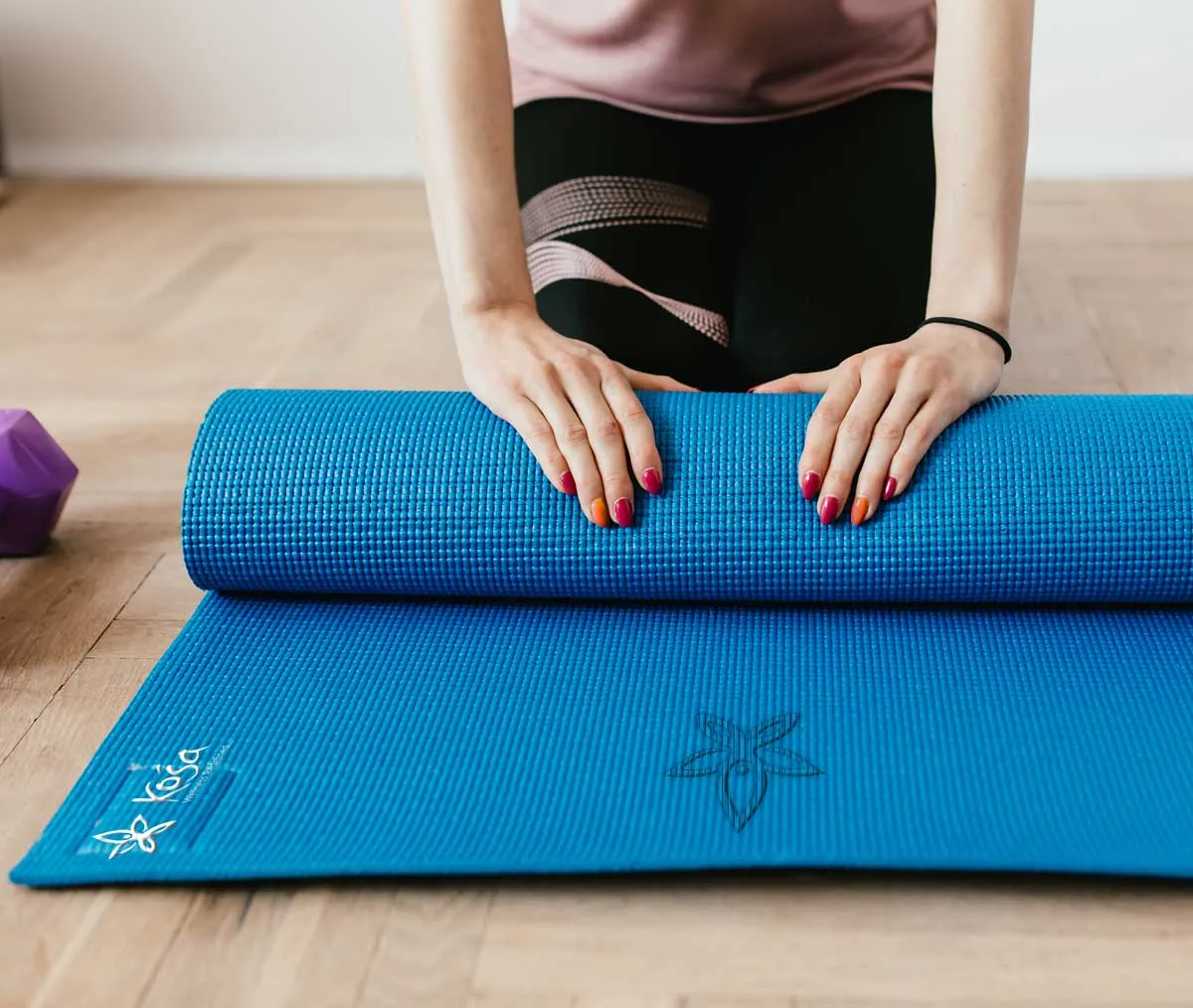
The work landed where it needed to. The overall brand positioning made total sense to the client, and the icon design and full visual appearance got genuine appreciation from both Kosa and their customers. It is always a good win when the look and feel connects equally well with the team behind it and the people walking through the door.
Logo symbol and visual design system Font scheme and color scheme Asset positioning guidelines A small usage guide


